Maven
brand, web, and events for community wellness
A year-long agency partnership with Maven Community Health: a refreshed identity and brand guide, an animated logo, a website designed page by page, intake and giving wired to one CRM, and a consistent presence across social, print, and events.

The challenge
One mission, three brands, and no website yet.
Maven Community Health connects the communities it serves to screenings, resources, and guidance. It needed a refreshed identity with clear rules, a website that could take intake, sponsors, registrations, and donations, and a steady flow of materials for events, partners, and social.
It also runs two related programs, The ManKave and SereniTea, whose sign-ups had to land in the same place. All of it had to feel like one organization, land on event deadlines, and stay easy for a small team to run.
Brand first · Identity
A refreshed mark that moves.
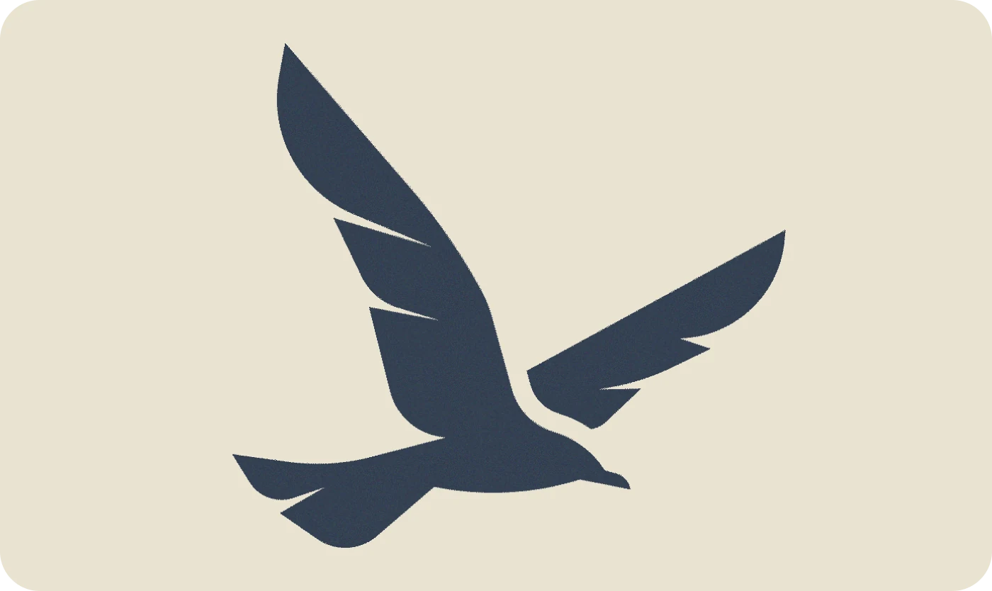
I explored several logo directions, from cleaner minimal versions to abstract marks and wellness-integrated concepts, then refined the chosen mark into a full logo system. An animated version gives video and social a signature open, and the identity carries through to email signatures and a QR phone wallpaper.
Brand guide · Version 1.2
Six colors, three typefaces, one clear set of rules.
The guide starts with why: Maven's mission is "to remove health barriers and empower thriving, equitable communities of color," and its tagline is "Cultivating Community Wellness." Every rule after that serves the mission.
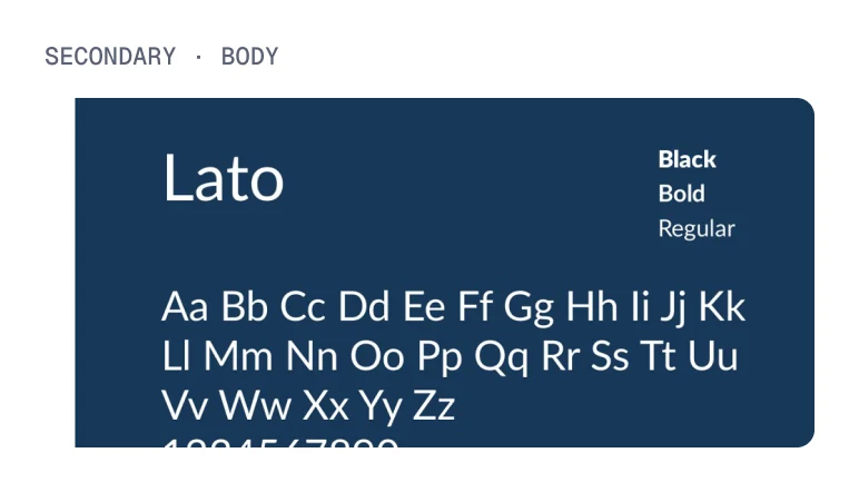
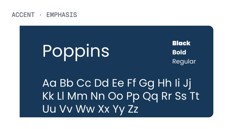
It sets an approved palette with a job for each color, a clear-space rule of one third of the "M," primary, stacked, and mark-only logo versions, a type system for headlines, body, and emphasis, and a photography focus on people of color engaging in wellness.
#0A3D62Headlines, trust#27AE60Calls to action#E67E22Community energy#2C3E50Body text, grounding#FFFFFFReversal, balance#6F1111Headlines, accents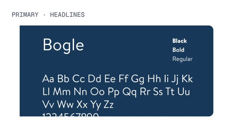
Core pillars, "BEAD"
Twelve months · By the numbers
One partner, every touchpoint
How the work came together
Four decisions that shaped it
PHONE TO PAGE
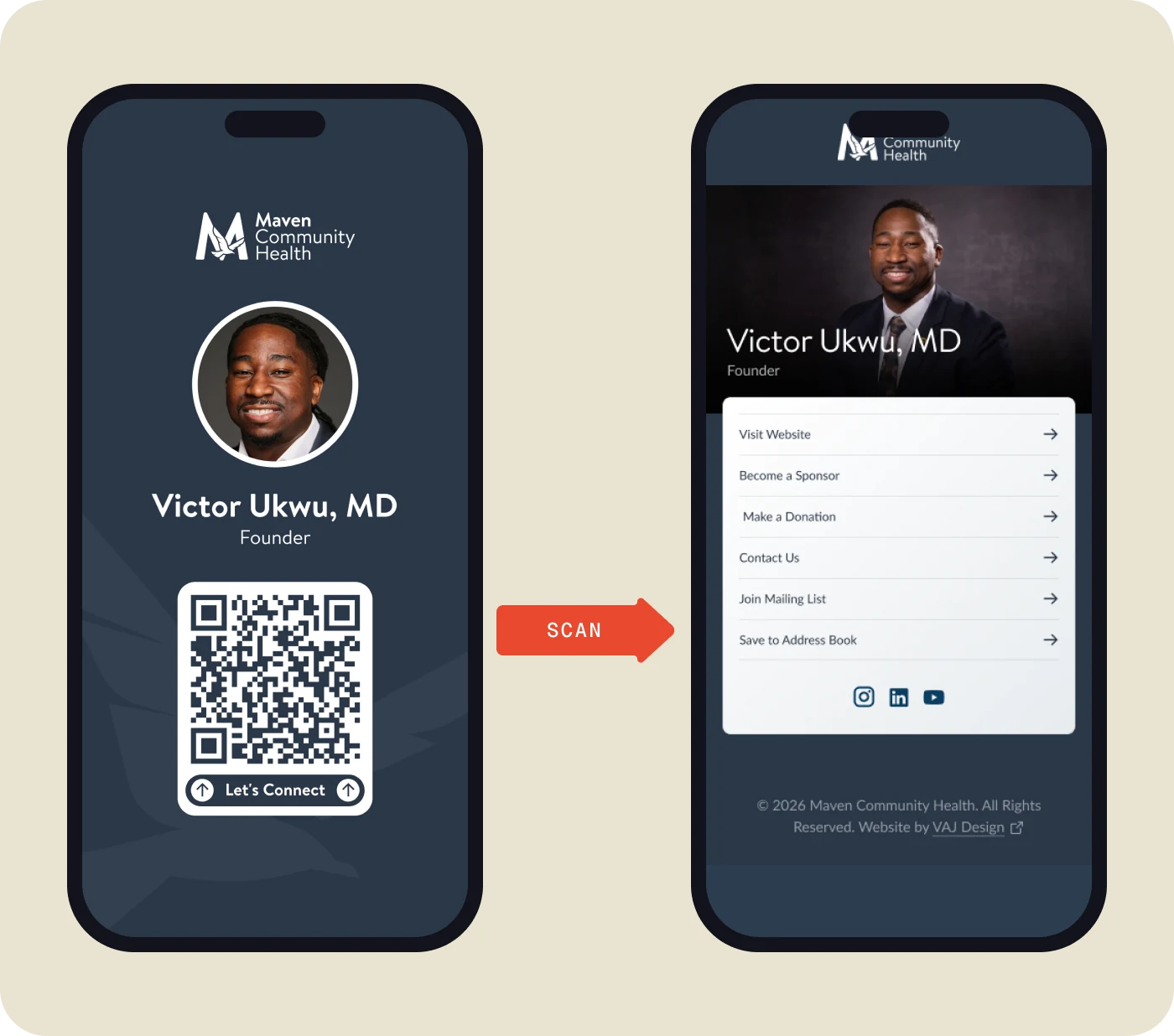
Scan the wallpaper, land on the page.
The founder's lock screen doubles as a business card: a branded wallpaper with a QR code that opens a link-in-bio page for the website, sponsorship, donations, contact, the mailing list, and a save-to-contacts link. It went live early, so Maven had a working front door at every event while the full site was designed.
ONE CRM
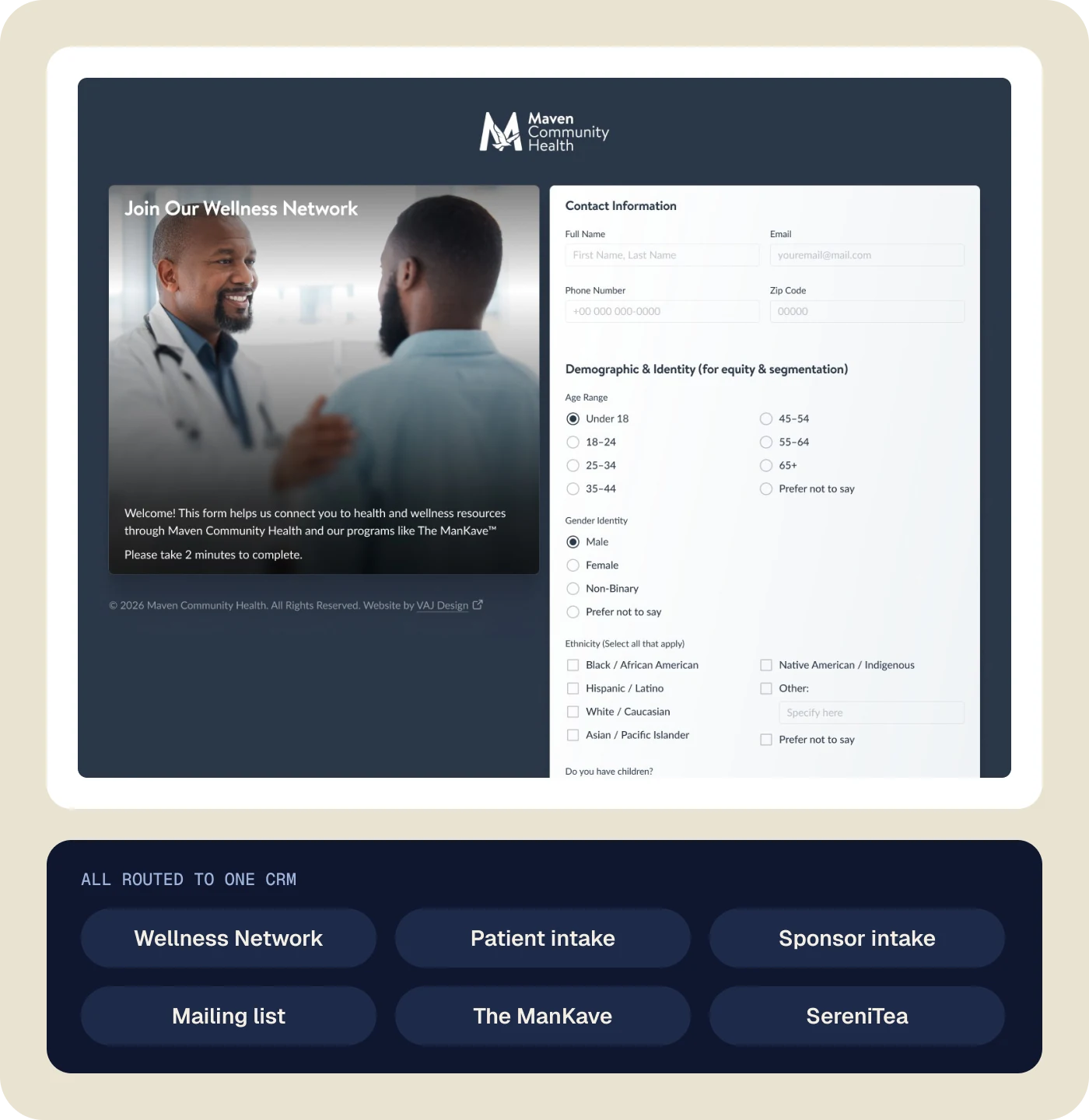
Every form leads to the same place.
The Wellness Network registration, patient and sponsor intake, the mailing list, and sign-ups for The ManKave and SereniTea all feed one CRM. I assessed the CRM, set it up in phases with role-based access, and mapped how each program's data routes into Maven's records, so a small team works from one list instead of six.
GIVING
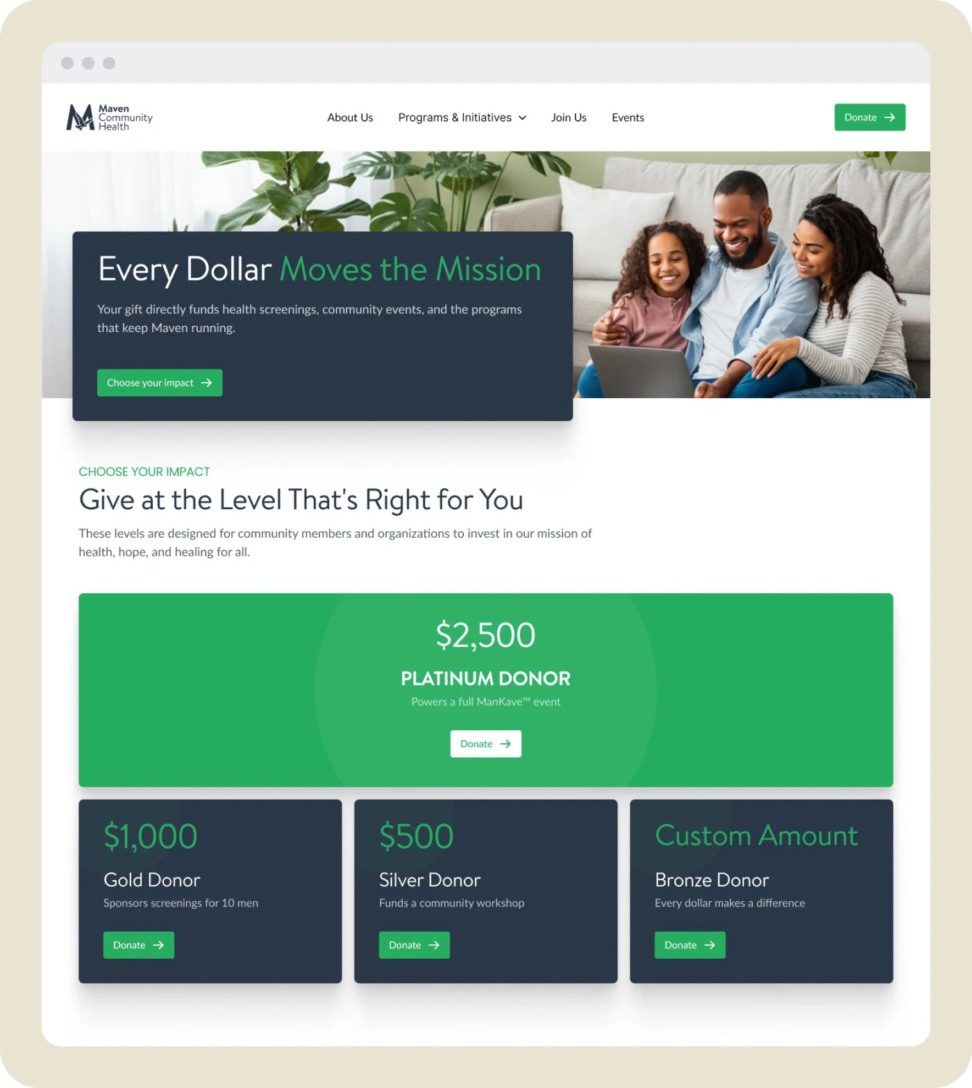
Every dollar has a place to go.
The Donate page leads with impact, then offers clear giving levels, from a Platinum gift that funds a full event to any custom amount. Behind it, I researched payment gateways, documented GiveWP with Stripe and PayPal, and tested donation receipts end to end.
SOCIAL
Branded on every platform.
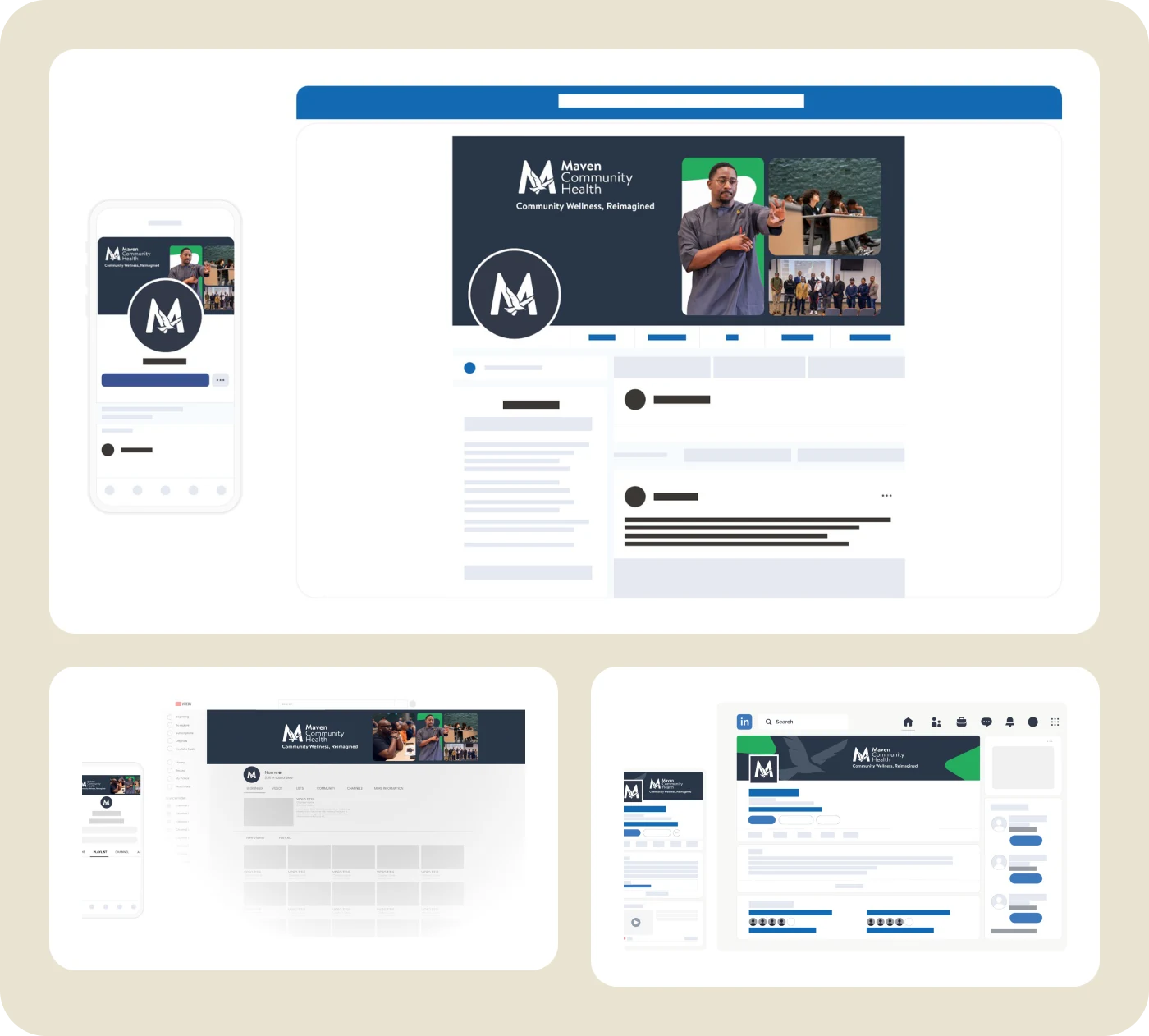
Cover banners and profile icons for Facebook, YouTube, and LinkedIn, each built inside platform safe areas and previewed on desktop and mobile before launch. Bilingual event flyers, a retractable banner, and infographics carried the same system into print.
The website
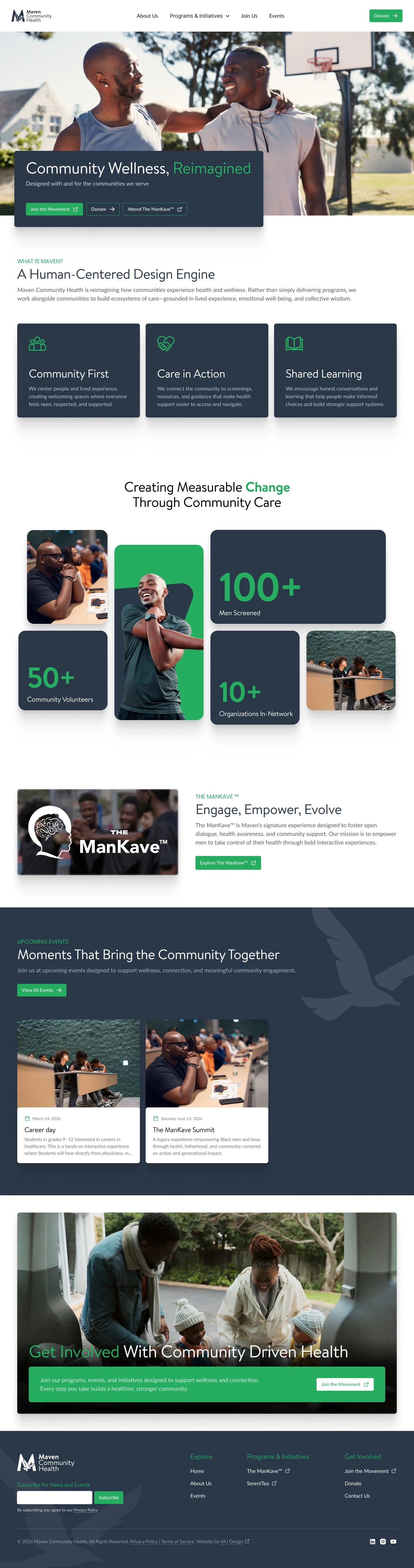
Eleven pages, designed for desktop and mobile.
Homepage, About, Programs, Events, Donate, Partner With Us, and the intake and registration forms, designed in Figma for desktop and mobile and built on WordPress with Elementor Pro.
Outcome
In one year, Maven went from a logo refresh to a full brand system, a designed and built website, working intake and giving, and a consistent presence across social, print, and events.
Design ahead, ship in slices
Designing the whole site up front kept every page consistent, while shipping small pieces first meant Maven never waited on a full launch to run an event.
Content is a dependency
Several finished designs waited on copy, imagery, or sign-off. I now plan content and approvals as milestones from day one, not as the last step.
Next case study — 03